Colour Mixing
 I’m often asked about colour mixing and I try to explain a few simple facts about the subject but it’s a topic that is both huge and small at the same time….. dependent upon how deeply you wish to go into it. I have no formal training in painting or colour theory but I have lashed together this document to capture my thoughts and observations on the subject. There may well be people who will take me to task for some of the information in here but this is only meant to be a starting point. The internet is packed with tutorials on the subject and you will find that “Google” and “YouTube” will be invaluable, as well as sites like It Was Weekend, who can help with mixing specific colours, including gold. You’ll find that it isn’t actually as scary as you thought…….practice is all you need.
Dave Hendry 2011
In the beginning……there were 3 colours……
Most people will be familiar with the ideas of basic colour mixing ie
Yellow + Blue makes Green
Red + Yellow makes Orange
Blue + Red makes Purple (some texts refer to the mix as being “Violet”…..but you get the general idea)
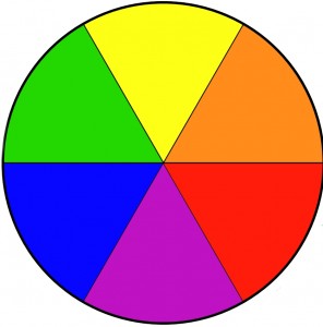 So….we understand that we can mix colours and arrive at another colour. BUT there are some colours that cannot be mixed and they are called “Primary Colours”….they are Red, Yellow & Blue. We cannot create these colours from other colours but if you start with these 3 colours you can mix an almost infinite number of other colours eg Green, Orange & Purple.
The 3 colours that were the result of mixing two Primary colours are called Secondary colours. Of course you can mix all proportions of, for example, yellow and blue resulting in different versions of a green. Some will be more “yellowish”, some more “blueish”
Meet the (Colour) Family…..
During your experiments with colour mixing 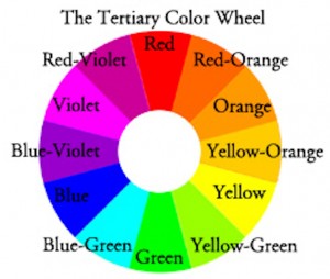 (as per this document) you will have seen lots of versions of, for example, orange. If you’d mixed more red in you will have created a “Reddish orange” and if there were more yellow the result would have been…….. wait for it, don’t get over excited and jump the gun…… (drum roll please)…. A yellowish orange.All this make perfect sense when you see another, slightly more complex colour wheel. The names reflect what has been added to the secondary colour to result in the tertiary colour
And then there were Three……
Up to now we’ve only discussed the result of mixing 2 primary colours together. We know that if, for example, we mix red with yellow we’ll create orange ie a “secondary colour”. We also know that if we modify this mix by adding some more of either of its primaries (ie either red or yellow) that we’ll end up with a “Tertiary Colour” eg “Red Orange” or “Yellow Orange”
If we observe the gradual change from 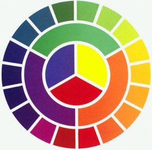 colour to colour around a colour wheel we can see almost a “Rainbow” effect. This colour wheel shows exactly the same information as the previous ones, the inner portions show the primary colours, the next ring out shows the secondary colours and the extreme outer ring shows more gradually changing mixes. These subtle changes in colour are the results of ever more fine additions of the adjacent primary colour to the existing colour.
But what happens if instead of adding, for example, gradually increasing amounts of red to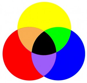 yellow resulting in the mix getting nearer and near (for all practical purposes) a red; we actually add the third, as yet un-added, primary colour…..in this example it would be blue.
For this we need to talk physics. Don’t worry, there wont be a test at the end. In a perfect world, with perfectly created primary colours; the result of mixing all three primary colours together would be to create black. In the real world, the imperfect world with imperfect colours; perhaps we should consider it as creating a “dark”…..some approximation of black. The colour wheel shown here also shows primary & secondary colours (ie green, orange & purple) but, where all the primary colours overlap (or mix) we get black.
As you can observe….. We have yellow, red and blue, the primary colours. We can also see the results of mixing the two adjacent primary colours to create 3 secondary colours ie orange, green and purple. Then we should note that where the 3 primary colours overlap the result is black. This is the only place that you’ll see it, as in practice you’ll end up with a “dark”. This may be a dark brown or a dark red or a dark blue…..but it will be dark.
This observation is very important because it highlights one more very important mixing principle and that is how to make your mix darker. For example, you’ve created a green by mixing blue and yellow but you wish to darken it. We have noted that when all 3 primary colours are mixed the result was a “dark”. We also know that when we mixed the green we used just two of the primary colours…….so what’s missing from a “dark”? The answer is the third, as yet unused, primary, in this case red.
So….. If you add (a small amount of) red to green the result will be to darken the green. The same holds true of orange (made from red & yellow) just add a touch of blue to darken it back. You will notice that this same effect isn’t as easily seen when attempting to darken purple because not only is purple already quite dark, yellow is a “weak” colour…… but it will work if you add enough of it. A “weak” colour?….. read on…….
Some Colours are just big Bullies……
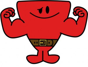
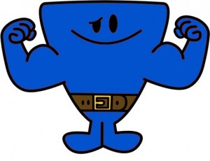 You will quickly discover that both red and blue are very
 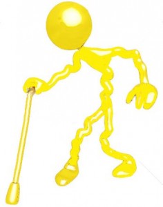 “powerful” colours and that yellow is a “weak” colour ie the smallest bit of red into a yellow mix will greatly change the colour from yellow to orange. If you start with a pool of red and start adding yellow then you’ll find that you’ll need to add huge amounts to turn the red into orange.
This is an important point to remember when mixing colours. Lets consider the relative mixing “power” that each colour has. As a guide only, considering their strength as being a value out of ten, then yellow can be considered as being at power level 3, Blue at power level 7 and red being at power level 8. So….. You could anticipate that if you mix yellow with red then you’d need 2 or 3 times as much yellow than the red for it to have an equal impact on the resulting mix.
Blue and red are more or less equal. Now…..lots of artists and tutors may well disagree with what they might consider to be an oversimplification but my thought is that if you realise that yellow is so weak then you’ll remember to do the following, very important, thing:-
When creating a mix always start with a pool of the weak colour and slowly add the more “powerful” colour
For example, when mixing orange, create a puddle of yellow and then add tiny amounts of red. Remember that if you don’t add enough red the first time that you can always add another tiny amount until you get the mix that you want.
It’s always been a mixing nightmare to start with the powerful colour (eg red) and then 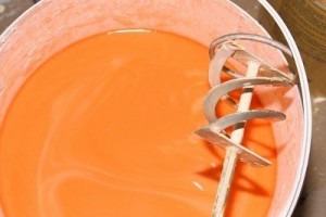 find that you need to add a bucket full of yellow before the correct orange is achieved. You probably now have enough to paint the Sistine Chapel but you only wanted sufficient to cover a few square centimetres. The very definition of frustration and cries of “I cannot get this flippin’ orange right”
This will be a very valuable lesson and will help to not only avoid frustration but will aid in actually achieving the colour that you want.
So…….. you now know that you can mix a series of colours using just 3 Primary Colours. You also know what those colours will be…….no guesswork needed there, and you know that those colours are called Secondary Colours. You also know what that if you play with the proportions of 2 Primary Colours you will create Tertiary Colours. We have discussed what happens when the third colour is added and how that addition will lead to darkening the mix.
But…………
if, for example, you were to take a certain mix of green and paint it onto some watercolour paper……..what would happen if you were to take the exact same mix but add some extra clean water to it? No extra blue, or yellow (or even, for that matter any other colour) just water. And then you did it again and added even more water….then again with more water still……..
You’d notice that the colour proceeded to get paler and paler until you were just painting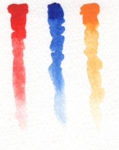 on clear water. You’d be tempted to think that you’ve changed the colour……. but you haven’t because you haven’t added any other colour to the mix…….. just water. Then what on earth has happened?
Well……… you’ve actually changed the “Tone” of the colour and tone or “value” is actually much more important than colour and will form the basis of another document. For the time being consider tonal values of colours in the same way that you might consider different shades of grey…… ie essentially the same just darker or lighter.
In reality you can create very successful paintings with just one colour if tonal values are  correctly used but will meet with little success using a full range of colour if tone isn’t correctly observed. The one shown here is a painting that I did of Eilean Donan Castle where only one colour but lots of tone was used.
This document should be viewed as a starting point, not comprehensive and will cause raised eyebrows amongst the trained artist fraternity. Never forget that it was written by a raving idiot.
Happy painting – Dave Hendry
ps I really should have advised you of this very important tip…….. After you’ve gone to all this trouble to mix exactly the correct colour for your needs then make very sure that you have enough of it. It’s awful to find that the perfect colour that you’ve mixed has run out and now you have the sometimes impossible job of not only mixing that green or orange; but you also have to get it exactly the same. That way lies madness…..lol……. take the tip….. make sufficient for your needs….. and a bit more.