I’m not sure that I like your Tone……
There’s a lot of confusion about tone when using colour but we can consider it a parallel to what we are very happy to accept when we think of values of grey. We’re comfortable with the idea that there are different “intensities” of grey, from very dark (almost black) to very pale indeed. In fact we have all seen photos in newspapers that are completely in shades of grey. So, how do the photos or paintings done in shades of grey (or monochrome) manage to give a convincing feel of depth and form. The answer is in the use of different tones.
As the chart to the right shows,  we ought consider tone in colour just as we do with tone in the grey scale.
The simple truth is that a successful painting or drawing may be produced using no colour (or just one) if tone is used correctly but a convincing painting will not result, however many colours are used; if tone theory isn’t correctly applied.
A good way of seeing if your painting (or any picture for that matter) has good tonal values is to scan it and create 2 copies of it. Using photo editing software convert one copy into a greyscale version and then compare the full colour version and greyscale side by side. If definition is lost in the greyscale version then chances are that the tonal values are not correct.
Look at the drawing to the right. We know  immediately what it is…….we know what shape it is. Why? We say “well, it’s obvious isn’t it……it’s a sphere” but how do we know? What is there about this 2 dimensional image that tells us that? Again the answer is simple……. And that’s half the battle in explaining some principles …..they’re often too obvious for us to see because we’ve spend a lifetime recognising shapes by the shadows and light that hits them.
 We know that this is a sphere by the shading on one side and the light on the other. But this is a tonal picture….. there is no “colour”. It’s true that this picture could have been created using a range of tone values of any one colour (as shown left) but it isn’t the colour that tells us the shape…… it’s the tonal values.
You will note that below each version of the drawing is a strip showing the tonal value range used. Note also how the eye is drawn to those areas where there is light against dark. So the correct use of tone not only makes our brain recognise the 2 dimensional picture as the 3D image that we want the viewer to see, but it also makes interest. We want the viewer to see that the tree is cylindrical, that the apple is spherical, that the field in our landscape undulates. This can all be achieved by correct application of tonal values.
But how do we create tone?
Well, as suggested in the Art Tip “Colour Mixing”, taking a specific colour that you may  have mixed or taken straight from your box of paints (or tubes), if you apply it to the paper with the minimum amount of water then you’ll create the darkest tone for that colour (without the addition of any other medium except water) If you then start to add more and more water to your mix then it’s not the colour that changes, but the tone. This is used quite often in graded washes. Note in the example here how the top is the darkest tone but gets lighter as water was added while coming down the paper. This technique is quite useful when doing skies, as by the time you get down to the horizon, where you may have a cottage or buildings etc; you will be able to create a good contrast between the light tone of the sky and the darker tone of your horizon features.
Just as we have a way to describe different colours, there are ways that name or quantify tonal values. The website http://www.finearttips.com gives a very good explanation (content from that site is shown below in blue):-
Value is how light or dark that color is.
 For example: If you took a black and white photograph of your painting, the shades of grey would be the different values or tones within the painting.
Believe it or not, value is more important  than color to the design and success of a painting.
- Value is used to create a focal point within a painting or drawing.
- The human eye is immediately drawn to a light element against a dark element. This creates, the focal point of interest.
- To create the illusion of depth, gradations of value are also used.
- Areas of light and dark give a three-dimensional illusion of form to subject matter.

The value scale (shown left) of Denman Ross was introduced in 1907. His value terms set the standard still used today. This scale helps artists understand and identify light, mid-tones and darks more easily.
Here are some examples of the successful recognition and use of tonal values (sometimes referred to as simply “value”, the two descriptions are frequently used interchangeably)
This is one of my own paintings. It’s of Eilean Donan Castle in Scotland (where some of the film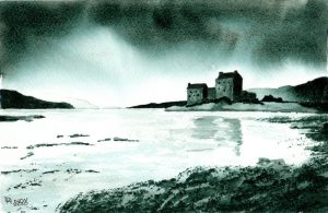
“Highlander” was made)

The picture to the left is of the 11th Century “Corfe Castle”in Dorset done by me again but this time in pen & ink. I have put quite a good amount of different tone in the picture but perhaps not quite enough to give the best contrast. It takes quite a lot of courage to start putting the necessary dark tones into your paintings and drawings as you can feel that you are going to spoil something that you have invested a lot of time and energy in.
One little trick that you might like to try is to scan the painting or drawing and then print it  out and practice the dark tone on the prints. I have found success in printing a scanned image onto 140lb Bockingford watercolour paper ie the same paper that the original painting will have been created on. If you cannot get your printer to do this then practicing on a paper print will hopefully give you the confidence to try it on the real thing.
As an exercise it’d be interesting to paint a landscape in colour then scan it and convert it to monochrome, then having noted where the light and dark tones are; paint it again but in one colour. I feel that my attempt in monochrome of Eilean Donan Castle is quite effective. It may be reasonable to suggest that it has more impact than it would in a multitude of colours. For those who are interested, the actual colour that I used was a mix of Phthalo Blue (which is not only a very strong blue but difficult to spell) and Burnt Umber, biased towards the blue. When I was mixing the colour I wanted to arrive at a mix that could be used for sky, water and buildings.
Anyone would be well advised to try this as an exercise……. paint a picture twice…..first in monochrome (ie like mine, just one colour but using varying amounts of water to arrive at different intensities or tones of the colour); then in colour. When you repeat the painting in colour you should have an increased feel for where the darker or lighter tone should be.
Again note two things about this Art Tip…….. one, that this is only meant as an introduction and “Google” and “YouTube” will be very helpful in furthering your understanding…….
……..and two, practice.
Good Luck
Dave Hendry November 2011